
Money Lactase Gummy
Brand Identity + Packaging Design + Illustration + Print & Marketing
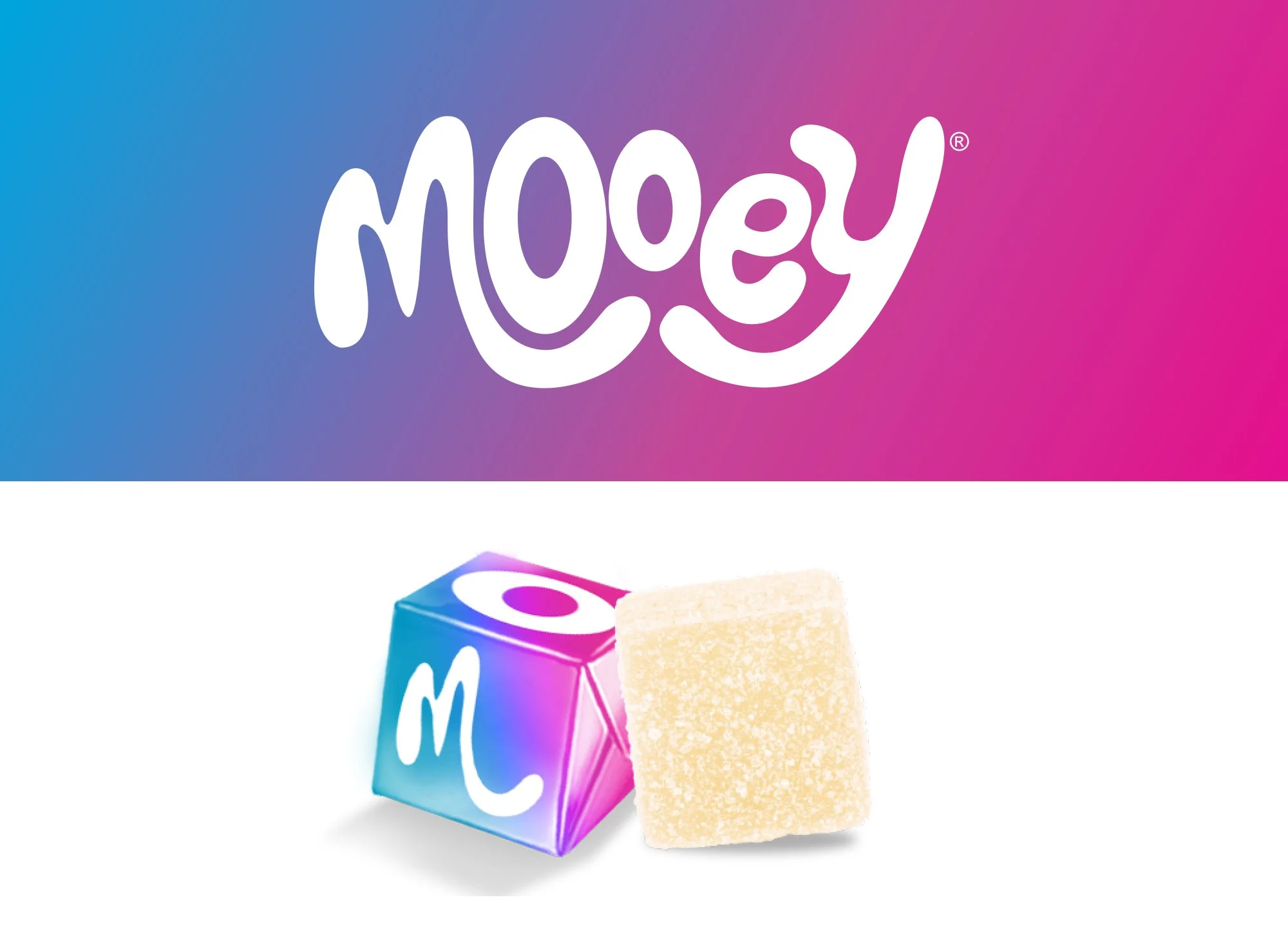
A fresh identity with plenty of personality.
Mooey needed a brand that felt approachable, memorable and just a little unexpected.
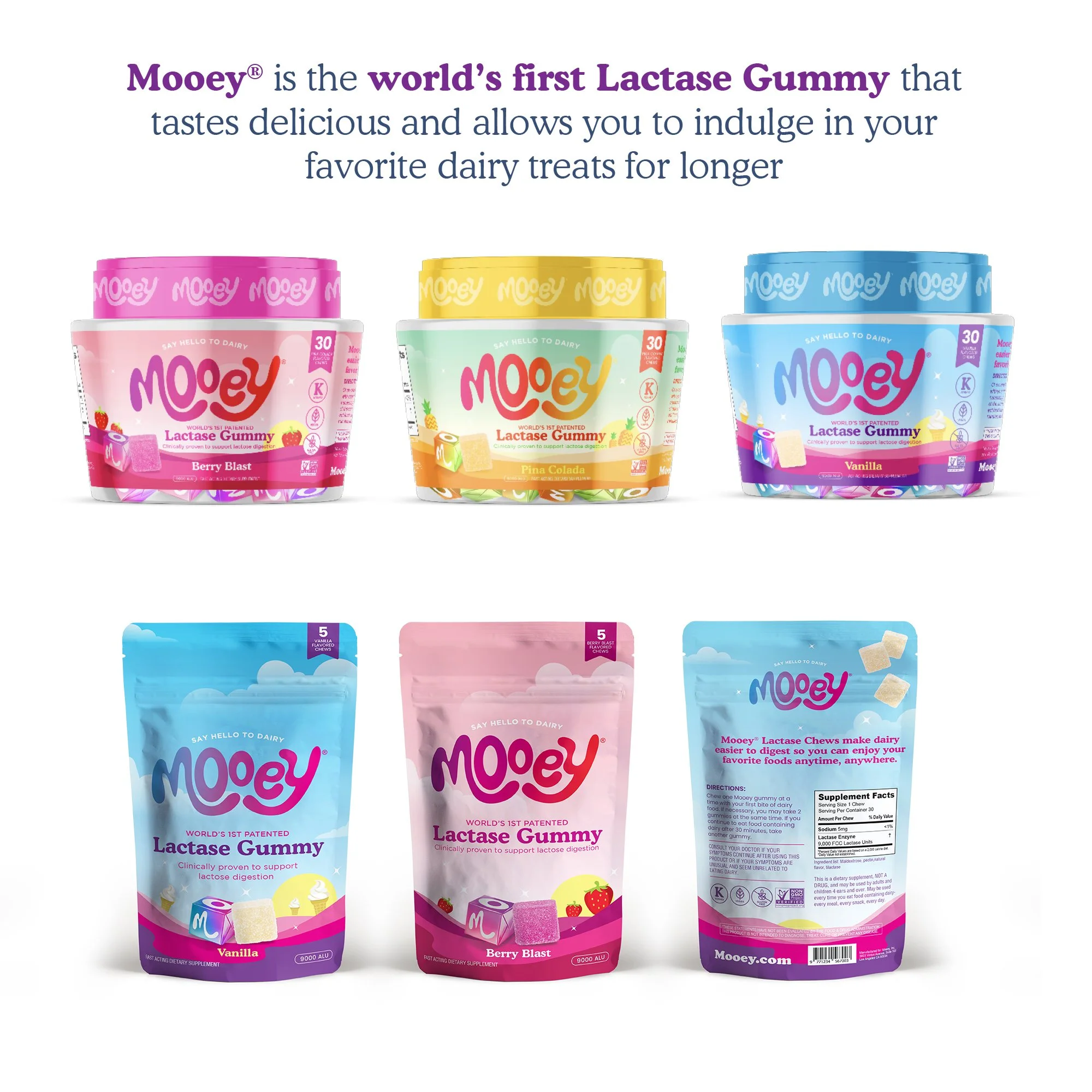
We created a playful visual identity designed to stand out, connect with customers and give the brand plenty of room to grow — from the core identity to packaging, print and everyday marketing.
The Challenge
The goal was to create more than a good-looking logo. Mooey needed a cohesive brand personality that could translate across different applications while remaining instantly recognizable. It had to feel fun without becoming childish, distinctive without being complicated, and flexible enough to work everywhere the brand showed up.
Our Approach
Keep it simple. Make it memorable.
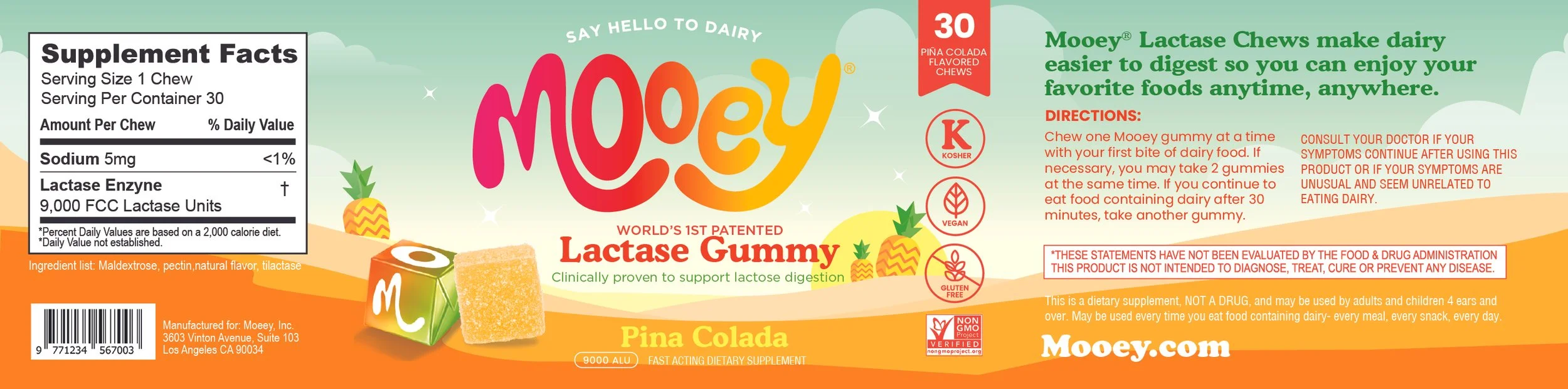
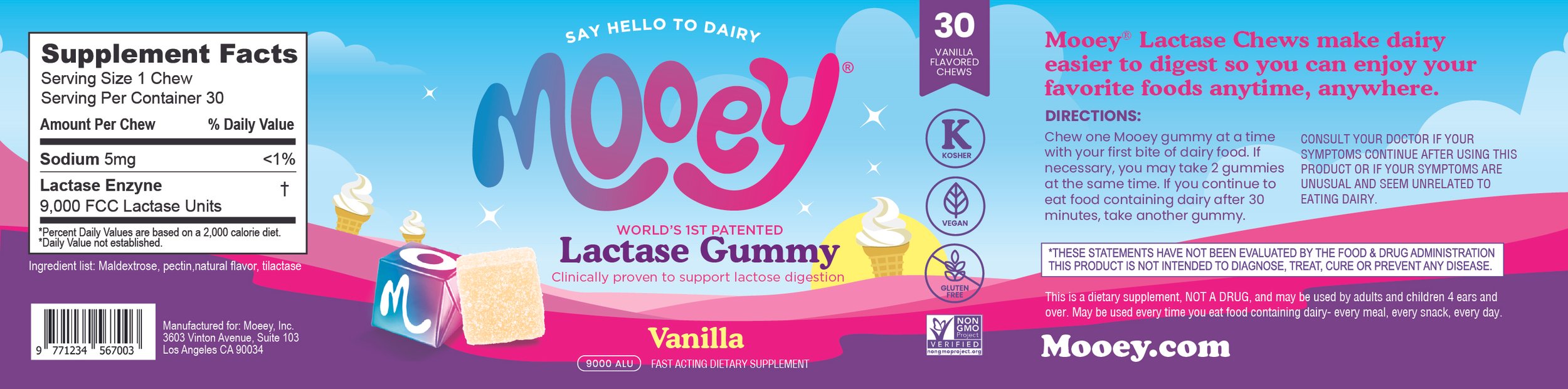
We built the visual direction around bold, uncomplicated design and a strong sense of personality. Clean typography, playful graphic elements and a distinctive visual style work together to make Mooey feel friendly, confident and easy to recognize. Every element was designed to feel like part of the same world.
Building the Brand
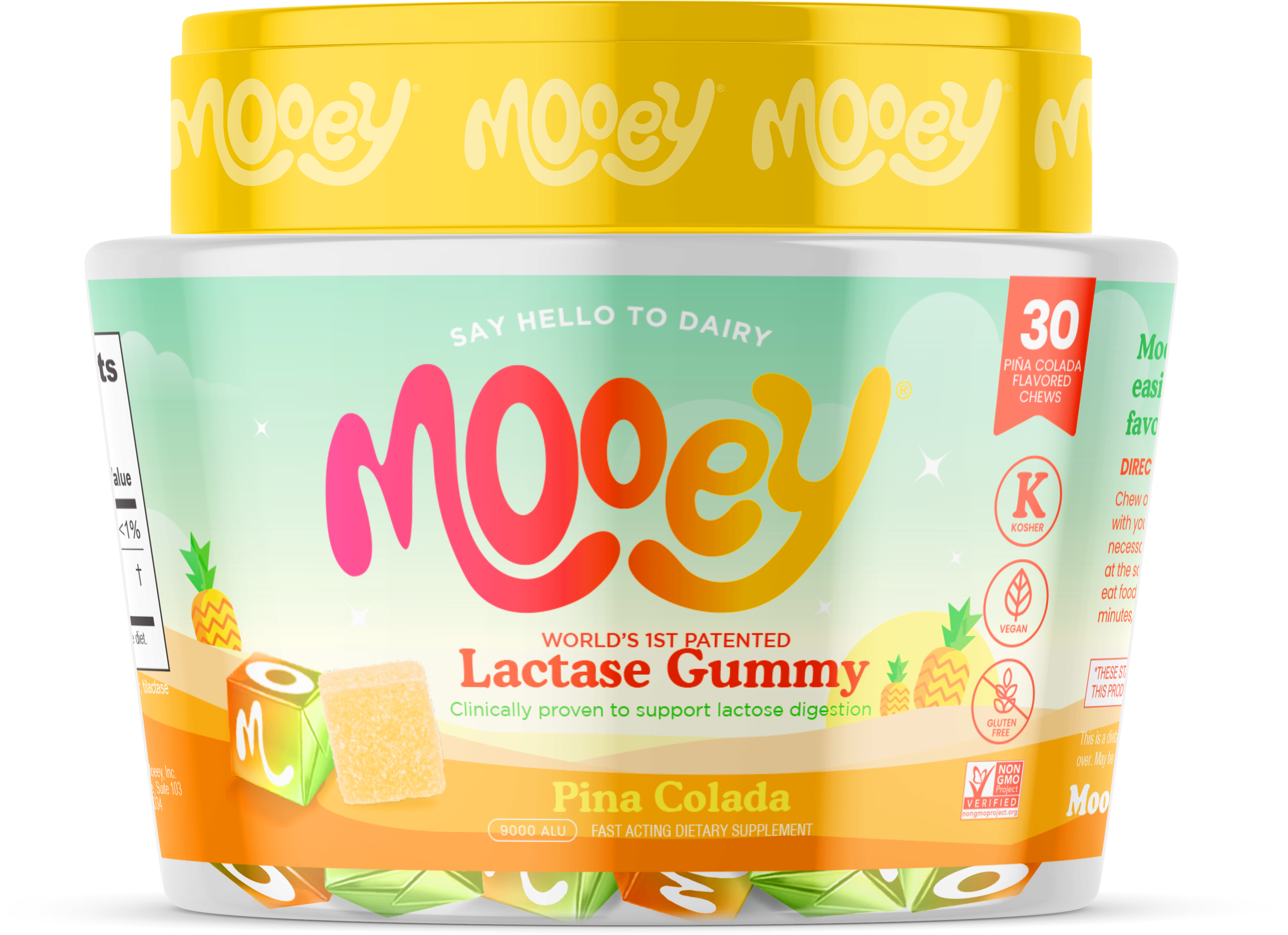
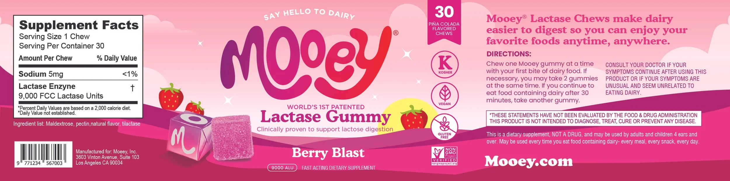
The identity became the foundation for a broader visual system. Rather than treating the logo as the finished product, we developed supporting elements that could bring more character to packaging, marketing materials and brand communications. That flexibility allows Mooey to stay consistent without every piece looking exactly the same.
The Result
A playful, flexible identity that gives Mooey something every growing brand needs:
A look that's easy to recognize — and hard to forget.